How to create a responsive mega menu using html and CSS
Learn how to create a responsive mega menu with navigation bars using Html and CSS with the complete source code shown here.
How to create a responsive mega menu using html and CSS
Table of content
- About the responsive mega menu
- Features of the responsive mega menu
- Script file includes
- Step by step on how to create the responsive mega menu
- How to run the downloaded source code
- The screenshots
About the responsive mega menu
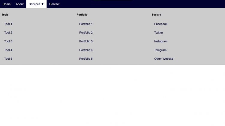
The responsive mega menu is a top navigation bar which includes many navigation bars or links inside. They mostly cover the entire width at the top with large dropdown. The responsive mega menu is created with html, CSS. Steps listed below.
Features of the responsive mega menu
- Dropdown Menu
- Navigation menu
- Mega menu
- Hover feature
- Responsive
Script files
- HTML
- CSS
Step by step on how to create the responsive mega menu
- Create a new folder to store all the files we will create and save
- Go to your code/ text editor
- Create a file named
index.htmland save in the folder we first created - Copy and paste the code below into the index.html Code below:
INDEX.HTML
<!DOCTYPE html>
<html>
<head>
<meta charset="UTF-8">
<meta http-equiv="X-UA-Compatible" content="IE=edge">
<meta name="viewport" content="width=device-width, initial-scale=1.0">
<link rel="stylesheet" href="style.css">
</head>
<body>
<div class="top-nav">
<a href="#">Home</a>
<a href="#">About</a>
<div class="dropdown">
<button class="dropbtn">Services ▼ </button>
<div class="dropdown-body">
<div class="menu-column">
<h4>Tools</h4>
<a href="#">Tool 1</a>
<a href="#">Tool 2</a>
<a href="#">Tool 3</a>
<a href="#">Tool 4</a>
<a href="#">Tool 5</a>
</div>
<div class="menu-column">
<h4>Portfolio</h4>
<a href="#">Portfolio 1</a>
<a href="#">Portfolio 2</a>
<a href="#">Portfolio 3</a>
<a href="#">Portfolio 4</a>
<a href="#">Portfolio 5</a>
</div>
<div class="menu-column">
<h4>Socials</h4>
<a href="www.facebook.com/alphacodecamp">Facebook</a>
<a href="www.twitter.com/alphacodecamp">Twitter</a>
<a href="#">Instagram</a>
<a href="www.t.me/alphacodecamp">Telegram</a>
<a href="https://alphacodecamp.com.ng">Other Website </a>
</div>
</div>
</div>
<a href="#">Contact</a>
</div>
<div style="padding:20px">
<h2>A Responsive Dropdown Mega Menu using HTML and CSS</h2>
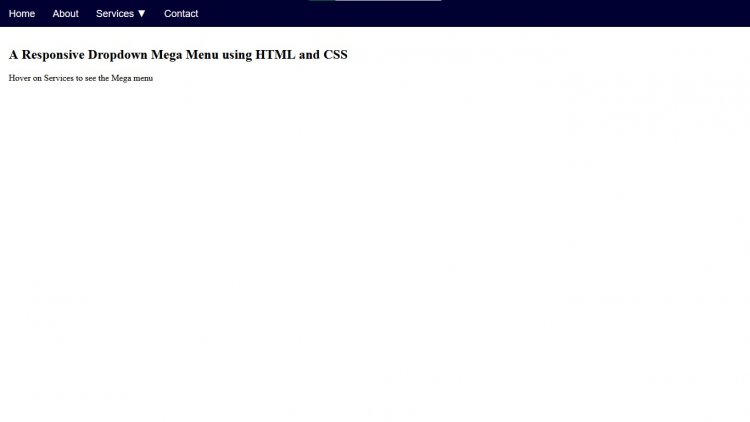
<P>Hover on Services to see the Mega menu</P>
</div>
</body>
</html>
- Then Create another file called css in the same folder we created.
STYLE.CSS
* {
  box-sizing: border-box;
}

body {
  margin: 0;
}

.top-nav {
  overflow: hidden;
  background-color:#000032;
  font-family: Arial, Helvetica, sans-serif;
}

.top-nav a {
  float: left;
  text-decoration: none;
  color: white;
  text-align: center;
  padding: 14px 16px;
  font-size: 18px;
}

.dropdown {
  float: left;
  overflow: hidden;
}

.dropdown .dropbtn {
    margin: 0;
    font: inherit;
    padding: 14px 16px;
    color: white;
    background-color: inherit;
    font-size: 18px;
  border: none;
  outline: none;
}

.top-nav a:hover, .dropdown:hover .dropbtn {
  background-color: white;
  color: #000032;
}

.dropdown-body {
    z-index: 1;
    position: absolute;
    background-color: #f9f9f9;
    width: 100%;
    display: none;
  left: 0;
}


.dropdown:hover .dropdown-body {
  display: block;
}

.menu-column {
  float: left;
  width: 33.33%;
  padding: 10px;
  background-color: #ccc;
  height: auto;
}

.menu-column a {
  float: none;
  color: #000032;
  padding: 16px;
  text-decoration: none;
  display: block;
  text-align: left;
}

.menu-column a:hover {
  background-color: #ddd;
  color: #000032;
}

 @media screen and (max-width: 600px) {
  .menu-column {
    width: 100%;
    height: auto;
  }
}
- Open your browser and run the html file. The output will look like the image below
How to run the downloaded source code
You can download the source code if you like. The zipped source code is attached to this article below; it can be downloaded from there.
- Go to the attached zipped file which is below.
- Then click on the attached zipped file to download it.
- Go to downloads folder on your computer and unzip/ extract it.
- Open the unzipped folder and double click on the index.html file to open it in your browser or
- You can open the code with your code/ text editor and modify.
Screenshots

Image2


